15 2.4 POPULATION IS DYNAMIC
Although the world’s population is still growing, the overall growth has slowed and the growth has become very uneven. Some places are still growing very rapidly. Others are growing much more slowly and some are shrinking in terms of population. We can compare differences between places using a series of different rates. Rates are ratios that divide the occurrence of a phenomenon with the population hosting the phenomenon. For example, crude birth rate is calculated as the number of births per 1000 people in a particular place in a particular year. The crude death rate is similar. It is calculated as deaths per 1000 people in a particular place in a particular year. These numbers can be used to compare places, but they have great limitations.
For one thing, they are aggregated variables describing the entire country; they tell you nothing about individuals within the country. Just because the average woman in a country has 2.3 children tells you nothing about a particular woman. The ecological fallacy is the idea that aggregated data tell you anything about individuals. It does not because it cannot. Once the data are lumped together, they lose their individual characteristics.
The rates do not necessarily relate to one another, either. The crude birth rate doesn’t tell you anything about the average number of children born per woman, at what stage in their lives women tend to have children, etc. The crude death rates don’t separate deaths of elderly people from deaths of infants. High rates of death are often found in developed societies; in many ways it’s a sign of development, since developed countries tend to have older populations. A high rate of infant mortality (children under 1 year of age) is a near-universal sign of underdevelopment. The countries with the highest crude birth rates tend to be low income (Figure 2.8).
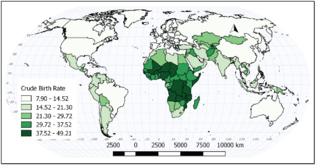
Figure 2.8 | Crude Birth Rate 20158
Author | David Dorrell
Source | Original Work
License | CC BY-SA 4.0
The crude death rate is more nuanced (Figure 2.9). Some countries on the map, for example, Chad, have a high crude death rate due to a high rate of infant and child mortality. Russia, on the other hand, has a rapidly aging population and a partially collapsed social security network.
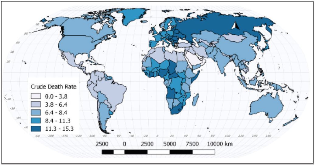
Figure 2.9 | Crude Death Rate 20159
Author | David Dorrell
Source | Original Work
License | CC BY-SA 4.0
The replacement level of a population refers to the number of births that are necessary to offset deaths. This is often referred to in terms of average fertility of women. In modern societies, on average, women need to produce 2.1 children in a lifetime to keep a place demographically stable. This number is derived by counting a mother and her partner, and accounts for those who never reproduce.
Places with a fertility rate below 2.1 will shrink over time. Those places above that will grow, and those well above that will grow quickly (Figure 2.10). The preceding graphic demonstrates that in the same way that many places are growing very rapidly, many places are at or below replacement. The United States is below replacement. It is demographically buoyed by immigration.
What kinds of places are growing fastest? These are places that are poor or economically or politically unstable. This may seem counterintuitive. Why would people have children in places that are already so poor? Remember that individual families have children. Children can seem like a mechanism for surviving bad situations. What kinds of places are declining? This is more complicated, but in general the more educated and empowered the female population is, the lower the birth rate. This isn’t a perfect, linear relationship, but it’s useful as a start. Why is there so much variability? Because places matter. Uganda has a government advocating population growth, while Afghanistan and Somalia have little governance at all. Russia and Australia have similar fertility rates, and few other similarities.
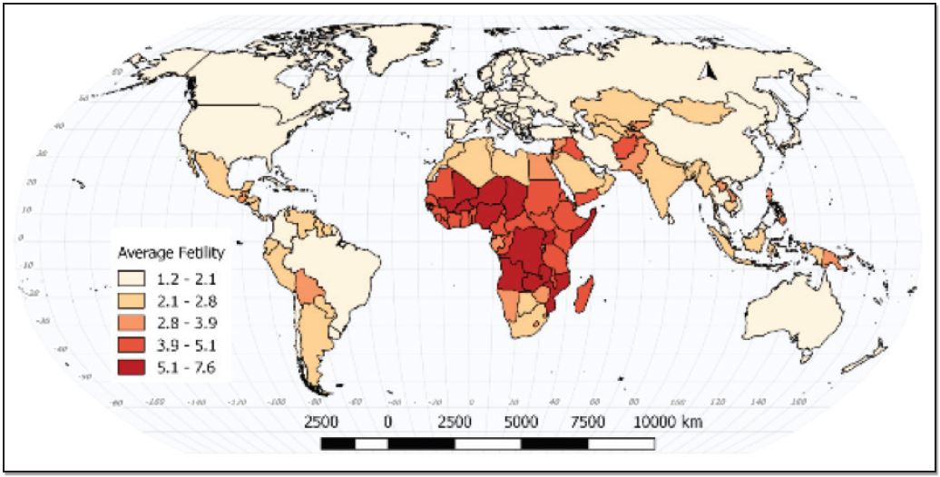
Figure 2.10 | Countries by Average Fertility 201510
Author | David Dorrell
Source | Original Work
License | CC BY-SA 4.0
General measurements of population are useful, but often if is useful to know the age and gender structure of a population. This is shown using a population pyramid. A population pyramid breaks the population into groups sorted by age ranges, called cohorts, as well as by sex. The resulting shape tells you a great deal about the population dynamic of the country. If the shape is actually a pyramid, then the country has a high birth rate and a high death rate. Countries with stable populations look like a column. Some countries even have their greatest population in the older cohorts with comparably few young people. Figure 2.11 shows some examples of current populations. Some examples of estimated future populations are shown in Figure 2.12.
First, it is important that you understand that all these numbers are estimates. Current population numbers are good enough for general comparison. As you can see, the differences between places becomes more pronounced as we look toward the future. The world population increases by over two billion people, but what is interesting are the shifting dynamics between countries. China shrinks by more than 30 million, the US grows by 64 million, and Niger- a poor Saharan country- grows by 52 million, more than double its current size! One of the most useful measures of population is doubling time, which is how much time it would take at current levels of population growth for a population to double. According to Figure 2.2, most of human history saw very slow growth with doubling times measured in centuries. During the 19th and 20th centuries, doubling time at the global level fell to as short as 35 years.
This has numerous implications. At the global level, those extra billions will need food and water, houses and clothing. That is to say that they will require resources. They will also have desires that require even more materials and energy expenditure. In places like Niger, this will be very difficult, if not impossible, to meet.
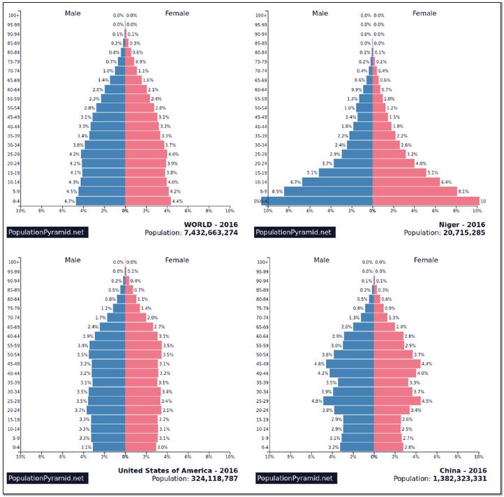
Figure 2.11 | Population Pyramids for select countries 2016
Authors | Martin de Wulf, David Dorrell
Source | PopulationPyramid.net
License | MIT License

Figure 2.12 | Population Pyramids for select countries 2050
Authors | Martin de Wulf, David Dorrell
Source | PopulationPyramid.net
License | MIT License
In places like China, a completely different problem presents itself. These populations are both shrinking and aging. Life expectancy, the average lifespan in a country, has been increasing for decades in developed and some developing countries. At the same time, birth rates have fallen for a variety of reasons. This means that as time passes, the elderly portion of the population has grown. Many countries will see their populations age until large percentages will be unable to work. Societies for the past several centuries have prepared themselves for population growth, and much of modern society is predicated on it. Population growth is what has paid for social security for the elderly. Few places have prepared themselves for fewer workers in the future (although robotics may address this problem). This change will not happen at once, but the effects will be tremendous. Another characteristic that must be acknowledged is population momentum.
When much of your population is older than 45, it isn’t reasonable to expect that population will continue to grow quickly. Countries with young populations should expect that their populations will grow when the large pool of young people have children of their own.
This map shows the tremendous differences in life expectancy from one country to another (Figure 2.13). In some places, people tend to live into their ninth decade. In others, they are unlikely to make it into their sixth.
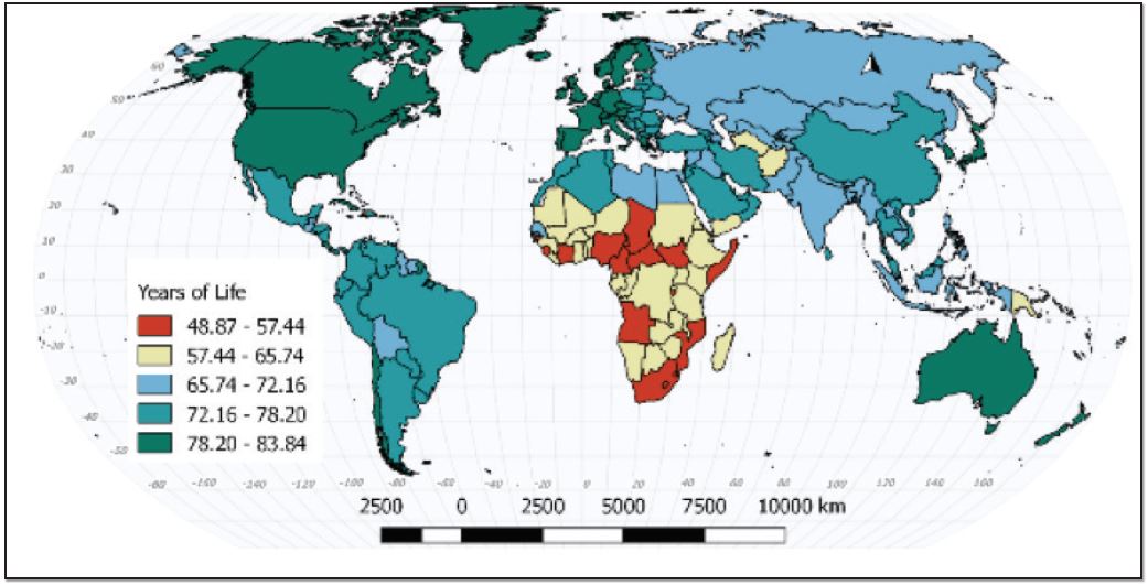
Figure 2.13 | Life Expectancy 201511
Author | David Dorrell
Source | Original Work
License | CC BY SA 4.0
The dependency ratio is simply the number of people within a society who do not work compared to the number who do work. There are two main components of the dependency ratio- children under 15 years old and the elderly over 65 years old, although the degree to which either group is dependent is variable (Figures 2.14 and 2.15). Children need care and schooling, but generally produce little of economic value. Elderly populations can be too infirm to work and are the part of the population with the highest medical costs. Where does the wealth come from to take care of these two groups? It comes from the people working and producing wealth. If the dependency ratio is high, then each worker can be responsible for a large number of dependents and less wealth will be left for the workers.
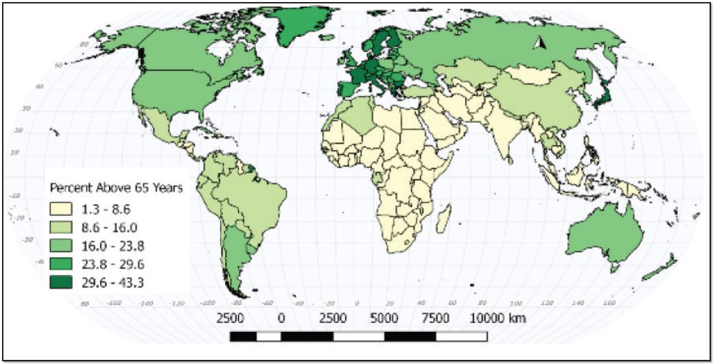
Figure 2.14 | Elderly Dependency Ratio 201512
Author | David Dorrell
Source | Original Work
License | CC BY SA 4.0

Figure 2.15 | Youth Dependency Ratio 201513
Author | David Dorrell
Source | Original Work
License | CC BY SA 4.0
Although the dependency ratio is used to compare places, this particular ratio can be somewhat misleading. In many less developed places, children are not dependent. They are not in school and they are employed. They are not consuming a family’s resources, but are instead contributing to them. In other places, the elderly may still be in the workplace. The dependency ratio informs decisions regarding the future. Will a country need more schools or assisted living centers. What does this mean for retirement or pensions? Perhaps more importantly, will the supply of workers increase or decrease? Comparing China, Niger, and the U.S. shows you that different places have different options and challenges.
